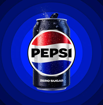
Pepsi Introduces New Logo
Ahead of its 125th anniversary, Pepsi has decided to revamp the company’s logo. The new design replaces the one used since 2008 and features a bolder font while maintaining the classic blue and red colors.
PepsiCo chief design officer, Mauro Porcini, told USA TODAY that the goal in redesigning the logo was to combine “great energy and confidence and boldness.” Additionally, Pepsi’s chief marketing officer, Todd Kaplan, explained the current logo as, “It’s this lowercase, italicized font, the blue is a little bit muted … it doesn’t exude that confidence and energy that the brand really represents,” per CNN.
Also, the new logo designs reportedly expected to draw attention to Pepsi’s zero-sugar line, which is a key part of the company’s growth plan, according to CNN.
Zero-sugar soda popularity has been growing as consumers are showing more interest. Pepsi recently changed its zero-sugar recipe and advertised the product during this year’s super bowl. “To highlight the zero line, the new logo uses black font and a black border, a nod to Pepsi Zero’s black can and label,” per CNN.


